Improving Fedora Font Rendering with Open Software and Fonts Only
It is continuously discussed that some Fedora users do not like the font rendering in Fedora Linux and there are solutions to improve the font rendering with potentially non-free or non-licensed software/fonts. However, with only the open source fonts and software and little tricks, the font rendering on Fedora can be quite good. In this post, I will introduce my method to improve Fedora’s font rendering with open software and fonts only.
First, take a look at the effect and decide whether you like it. You can proceed if you like this approach of improving the font rendering.

Fonts
The Gnome 3 use Cantarell fonts as the interface fonts. However, I am not a big fan of the Cantarell fonts and prefer the Liberation fonts. Fedora ships Liberation fonts but ships with the Liberation font version 1 (I am using Fedora 20 now). On the other hand, the Liberation fonts version 2 is already released on its website. The version 2 of Liberation fonts, from my experience, is rendered much better than the version 1. Hence, let’s install Liberation version 2 to be used.
First, download the tar ball from the Liberation fonts website: https://fedorahosted.org/liberation-fonts/ .
Second, unpack the tar ball and copy the TTFs to ~/.fonts for user wide usage, or to /usr/share/fonts/truetype/liberation for system-wide availability.
Last, run fc-cache to make the fonts cached.
Font rendering
After installing the Liberation fonts, we can alias the Sans, Sans-serif and etc to it. You can put a copy of the local.conf (mine can be downloaded from here) to specify the font aliasing to /etc/fonts/local.conf. Note that my local.conf contains configuration for Chinese fonts fallback. You may adapt it for your own preference.

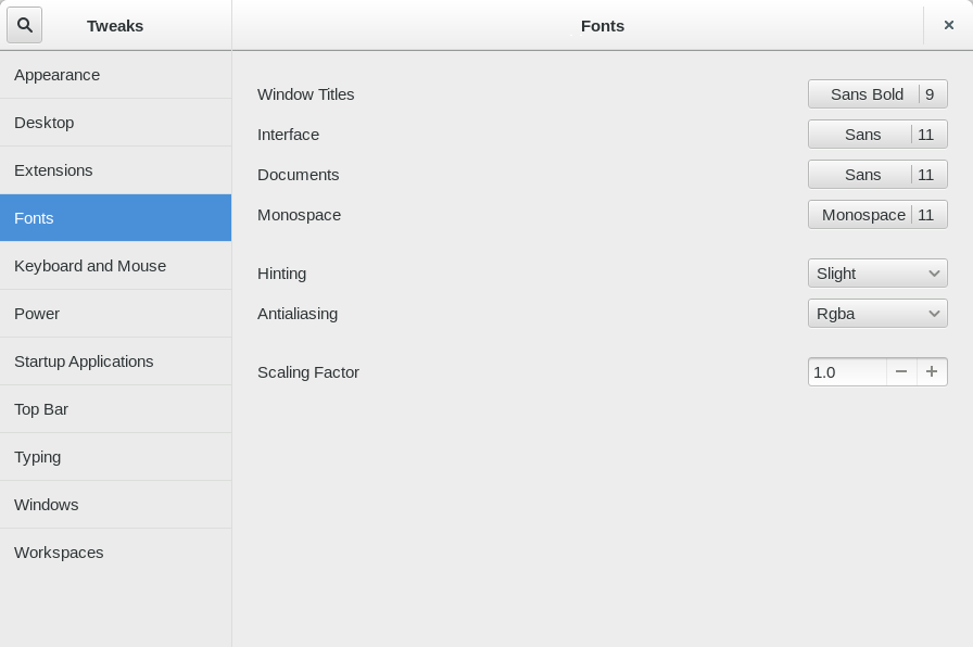
Lastly, we can choose the fonts of Gnome 3 and tune the font rendering. To do this, you need gnome-tweak-tool which can be installed by # yum install gnome-tweak-tool.
For the interface fonts, I use Sans. For the hinting and Antialiasing, I use “Slight” and “Rgba”. The “Slight” hinting seems the best to my eye which hints the fonts and keep the original shape of the fonts.
Thanks for the tips! Font rendering indeed looks better now on Fedora 21, I guess primarily by installing the new Liberations fonts and the local.conf file.